
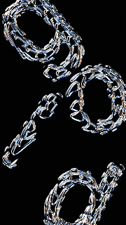
Animated Brand Titles
Explore these dynamic typography sequences for various startup’s and businesses product launch videos, content and visual explorations, designed to mirror their ethos.
Graphic Design
Typography
The Basics
Designed to blend timeless creativity with modern efficiency, offering a seamless experience for both clients and their customers.
These animations blend various geometric transitions with organic fluidity, creating a visual metaphors for bridging human creativity with cutting-edge design.
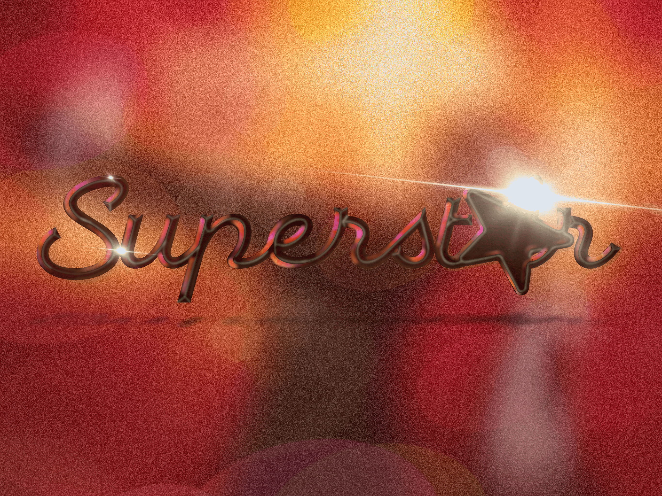
My work demonstrates how thoughtfully animated text can transform an ordinary brand presentation into something distinctive and memorable. Through techniques like morphing elements, dynamic color transitions, and expressive scale changes, I create brand moments that capture attention and leave lasting impressions. Each project in my collection represents my belief that when typography moves with intention, it doesn't just display information—it tells a story.
Tools Used:
Adobe After Effects (expressions-driven animations and various exports), Blender 4D (3D extrusion), Procreate for iPad (for hand drawn lettering and design).
I explore the dynamic world of kinetic typography—the art of bringing text to life through thoughtful animation. When I create these pieces, I'm not just designing static logos; I'm crafting memorable visual experiences that communicate brand personality through movement. Each animation decision I make serves the brand's identity, whether it's the gradual reveal of characters that builds anticipation, the rhythmic flow of words that creates energy, or the synchronized motion that enhances meaning.

Exploring The How
Techniques: Procedural text synchronization to audio waveforms, kinetic typography with staggered reveals, hand drawn frames, and depth-driven parallax scenes.
I approach each project by first understanding the brand's core values and audience, then translating these insights into motion that feels authentic and purposeful. The timing and pacing of my animations are carefully considered to guide viewers' attention and create emotional resonance. I find that the most successful kinetic typography maintains perfect balance—enough movement to engage but not so much that it sacrifices legibility or overwhelms the message.
By choreographing a deliberate sequence that builds anticipation and enhances comprehension. These reveals aren't random—they follow principles of visual hierarchy that emphasizes key brand messages.
To further add authentic character and uniqueness, I incorporate hand-drawn frames into my animations. This brings a human touch to digital movement, with each frame meticulously illustrated to create fluid, organic motion that feels less computerized and more crafted. This technique provides distinctive animations that stand apart from template-driven motion graphics.
I complete these compositions with depth-driven parallax scenes, creating a sense of three-dimensional space by animating different text elements at varying speeds and distances.


More Works

FAQ
01
What does a project, with you, look like?
02
How is the pricing structure?
03
Are all projects fixed scope?
04
What is the ROI on investing in Branding Design and Creative Marketing for my business?
06
What do I need to get started?
Animated Brand Titles
Explore these dynamic typography sequences for various startup’s and businesses product launch videos, content and visual explorations, designed to mirror their ethos.
Graphic Design
Typography
The Basics
Designed to blend timeless creativity with modern efficiency, offering a seamless experience for both clients and their customers.
These animations blend various geometric transitions with organic fluidity, creating a visual metaphors for bridging human creativity with cutting-edge design.
My work demonstrates how thoughtfully animated text can transform an ordinary brand presentation into something distinctive and memorable. Through techniques like morphing elements, dynamic color transitions, and expressive scale changes, I create brand moments that capture attention and leave lasting impressions. Each project in my collection represents my belief that when typography moves with intention, it doesn't just display information—it tells a story.
Tools Used:
Adobe After Effects (expressions-driven animations and various exports), Blender 4D (3D extrusion), Procreate for iPad (for hand drawn lettering and design).
I explore the dynamic world of kinetic typography—the art of bringing text to life through thoughtful animation. When I create these pieces, I'm not just designing static logos; I'm crafting memorable visual experiences that communicate brand personality through movement. Each animation decision I make serves the brand's identity, whether it's the gradual reveal of characters that builds anticipation, the rhythmic flow of words that creates energy, or the synchronized motion that enhances meaning.
Exploring The How
Techniques: Procedural text synchronization to audio waveforms, kinetic typography with staggered reveals, hand drawn frames, and depth-driven parallax scenes.
I approach each project by first understanding the brand's core values and audience, then translating these insights into motion that feels authentic and purposeful. The timing and pacing of my animations are carefully considered to guide viewers' attention and create emotional resonance. I find that the most successful kinetic typography maintains perfect balance—enough movement to engage but not so much that it sacrifices legibility or overwhelms the message.
By choreographing a deliberate sequence that builds anticipation and enhances comprehension. These reveals aren't random—they follow principles of visual hierarchy that emphasizes key brand messages.
To further add authentic character and uniqueness, I incorporate hand-drawn frames into my animations. This brings a human touch to digital movement, with each frame meticulously illustrated to create fluid, organic motion that feels less computerized and more crafted. This technique provides distinctive animations that stand apart from template-driven motion graphics.
I complete these compositions with depth-driven parallax scenes, creating a sense of three-dimensional space by animating different text elements at varying speeds and distances.
More Works
FAQ
What does a project, with you, look like?
How is the pricing structure?
Are all projects fixed scope?
What is the ROI on investing in Branding Design and Creative Marketing for my business?
What do I need to get started?